
Treize Grammes has just completed a full rebrand, transforming both their agency and website. The decision came after recognizing a gap between their brand identity and the agency’s growth. Their previous communication style no longer reflected who they had become, which led to missed opportunities.
Shifting Client Expectations
The needs of their clients have evolved. Today’s clients have bigger ambitions and are looking for partners who can help them achieve their bold visions. Treize Grammes needed a brand that conveys confidence and capability—one that assures clients they are equipped to deliver on these elevated expectations.
Ambition to Grow
Treize Grammes isn’t just keeping up with change; they’re embracing it. The rebrand is more than just a visual refresh—it’s a statement of intent. They’re setting their sights on larger, more impactful projects and want their new image to reflect this bold ambition.

Why Webflow?
Treize Grammes chose to build their new site on Webflow for three key reasons:
Control & Flexibility: Webflow gives them more autonomy over site management and future updates, making it easier to adapt as the agency continues to grow and evolve.
Stability: They needed a platform they could trust—one that offers reliable performance without compromising on quality.
Creative Freedom: With Webflow’s robust coding capabilities, they can push the boundaries of design and creativity, bringing to life the bold, unique ideas that define their agency.
Brand Concept & Challenge
Their vision is straightforward: bring dead brands back to life—and do it in a way that feels effortless for their clients. To achieve this, they chose to reclaim a familiar symbol: the classic ON/OFF button. This iconic UI element now serves as the focal point of their communication, representing transformation and renewal.
The Challenge? They’re well aware that this concept can come across as cliché and overused. But that’s where the opportunity lies: the true challenge is pushing their creativity to reimagine and redefine something that many consider overplayed. Through inventive design and clever animations, they aim to breathe new life into a symbol everyone thought they knew.
Development
It all begins with the style guide—built directly in Webflow. Setting up and managing variables within the platform is more intuitive than coding them manually in CSS through VSCode. This approach not only streamlines the process but also makes it easier for clients to make adjustments down the line, giving them more flexibility and control over their site’s future updates.
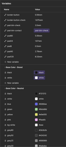
The new branding for Treize Grammes is rich in vibrant colors and diverse font weights, making it essential to establish a strong foundation with these guidelines first. Once the visual elements were set, I moved on to building the structure using HTML and CSS directly in Webflow. For more complex styling needs, I incorporated custom CSS to ensure that the site remains flexible and scalable for future development.
Development Priority
When I receive the Figma design, I always start by focusing on the most complex sections and animations. By tackling these challenging elements first, I ensure that the trickiest parts are out of the way, allowing for a smoother workflow as the project progresses.
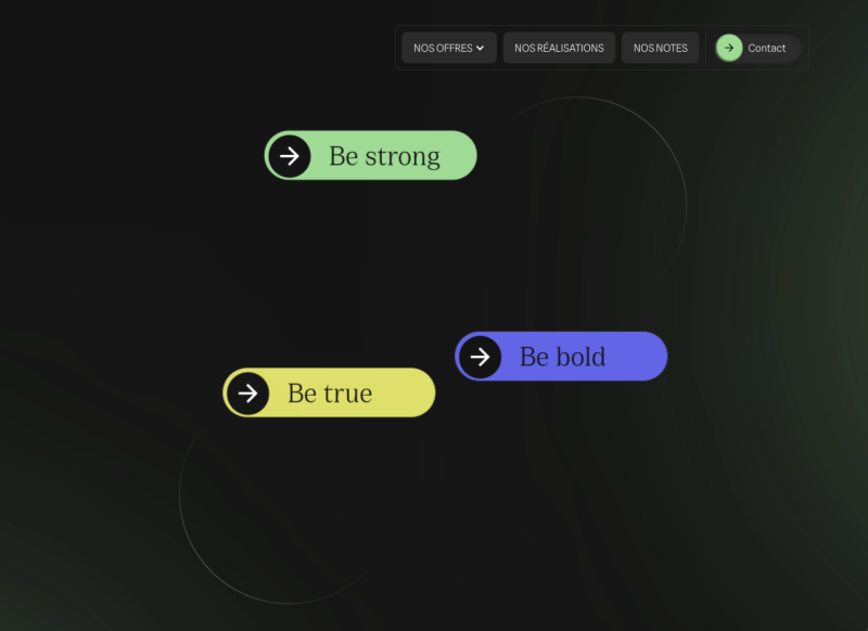
My development approach is to work page by page. Some developers build all the HTML first, then move on to CSS, and finish with animations, while others prefer a mobile-first strategy. I choose to build each page individually, always starting with the most difficult. Naturally, I began with the homepage, where I aimed to include as many micro-interactions as possible to create a strong “wow” effect from the very first visit.
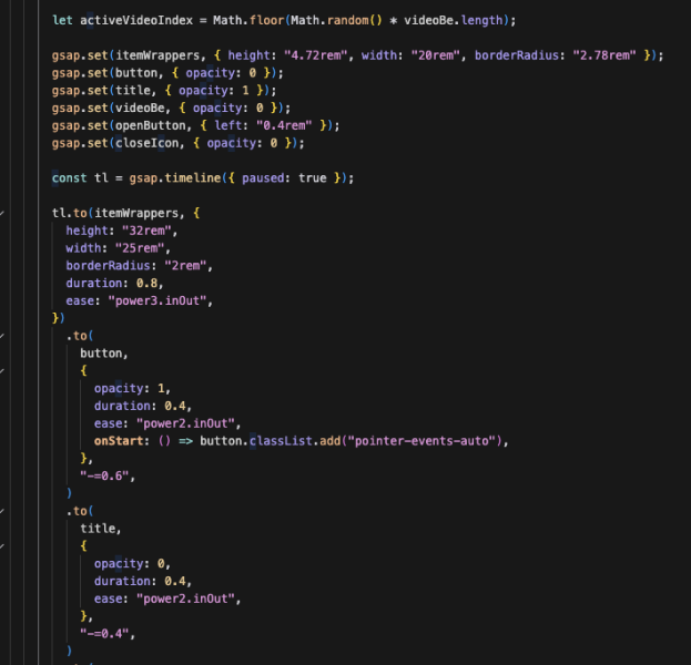
Button to Video
What appears to be just three classic buttons inside a div at first glance is much more than that. While you might expect a simple hover animation, there’s actually a lot more happening behind the scenes, involving multiple elements working together to create a seamless interaction.
To achieve the desired effect, I had to carefully select every element inside the “fake button” and activate them individually on hover. The fake button transitions into a video, the toggle morphs into a close button, and the entire interaction reveals a new button at the bottom, prompting users to take action.
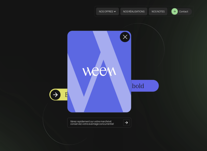
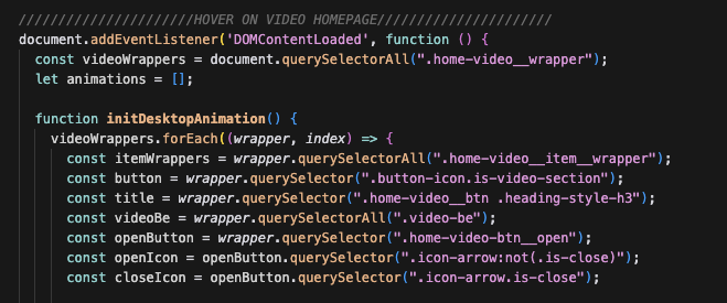
To bring this interaction to life, I used GSAP to build a custom timeline filled with visibility conditions.
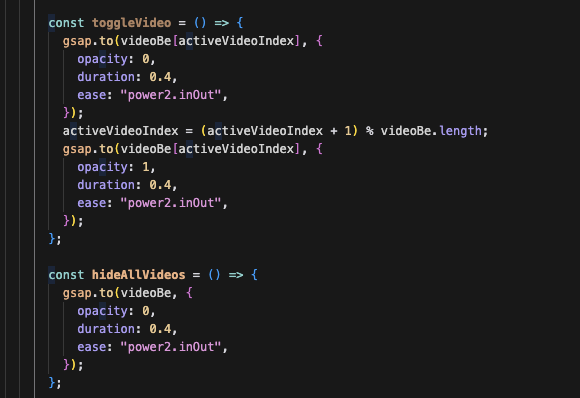
Why start with this element? Based on the Figma design and Treize Grammes’ instructions, we needed to provide visitors with the flexibility to either close the video manually or simply hover out to reset the interaction.
Additionally, there are several videos stacked on top of each other, and each video respects the visibility of the others to ensure that no competing clients appear on the same visit 🧠
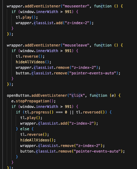
Once the animations were in place, I needed to manage the z-index to ensure that the button always stayed in front of the other elements. To achieve this, I created a dedicated CSS z-index class and dynamically applied it to the elements on hover.
Partners & Services
This section gave me a bit of trouble at first. I had a clear concept in mind, but as I started working on it, I ran into some unexpected challenges. Initially, I planned to use percentages for sizing. However, I quickly realized this approach would cause inconsistencies across various screen sizes. To address this, I switched everything to rem, which provided better responsiveness and stability.
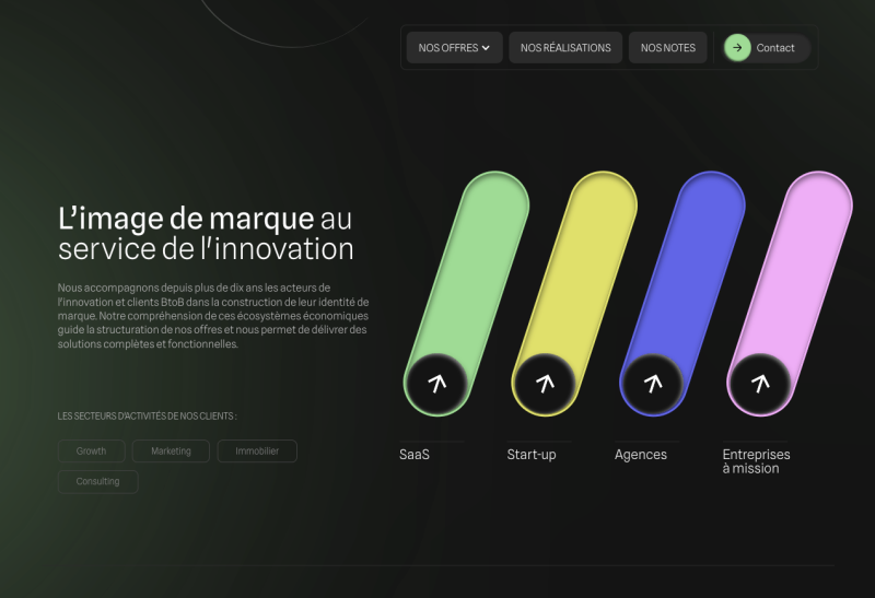
The goal was to create a fixed-size colored div with five equally-sized divs nested inside. On click, I calculated the space required to maintain the parent div’s padding and shifted the elements accordingly, ensuring smooth and precise alignment.
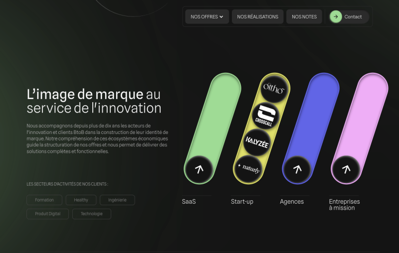
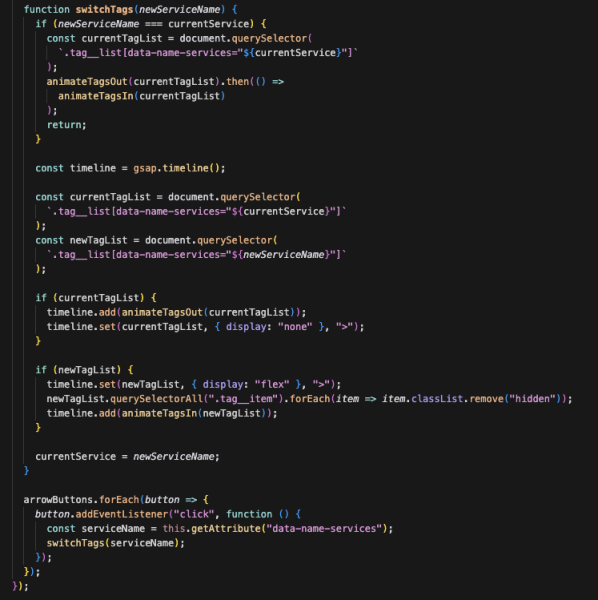
For the service tags linked to each partner, I connected a CMS database to the buttons using data attributes. When a button is clicked, the tags with active data attributes “fall” away, and new tags corresponding to the selected partner appear, creating a dynamic and interactive experience.
“Francis, I Have an Idea.”
This section was initially designed to be completely static. But during the build, I felt something was missing—something that could really elevate the ending of the site. Even after implementing the fade-up scroll animations, I knew we could push it further. So, I called Francis from Treize Grammes, and over coffee, I said, “Dude, I have an idea. I’m sure people are going to love it.”
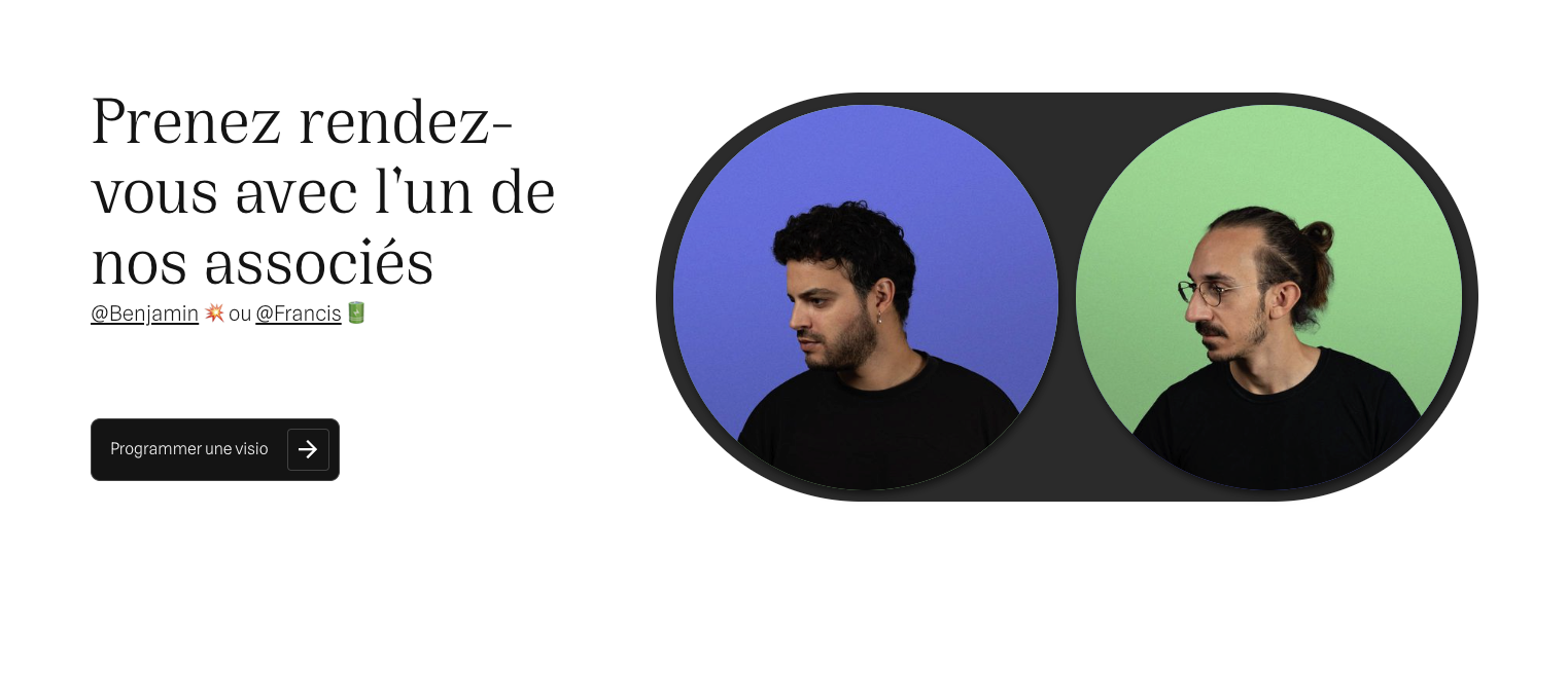
I asked him and Benjamin to take some pictures, several angles—at least six—and I’d take care of the rest!
That’s how the idea came to life: swapping images based on hovering over different buttons and social links. This animation turned out to be the highlight, and I think it’s the one people loved the most.
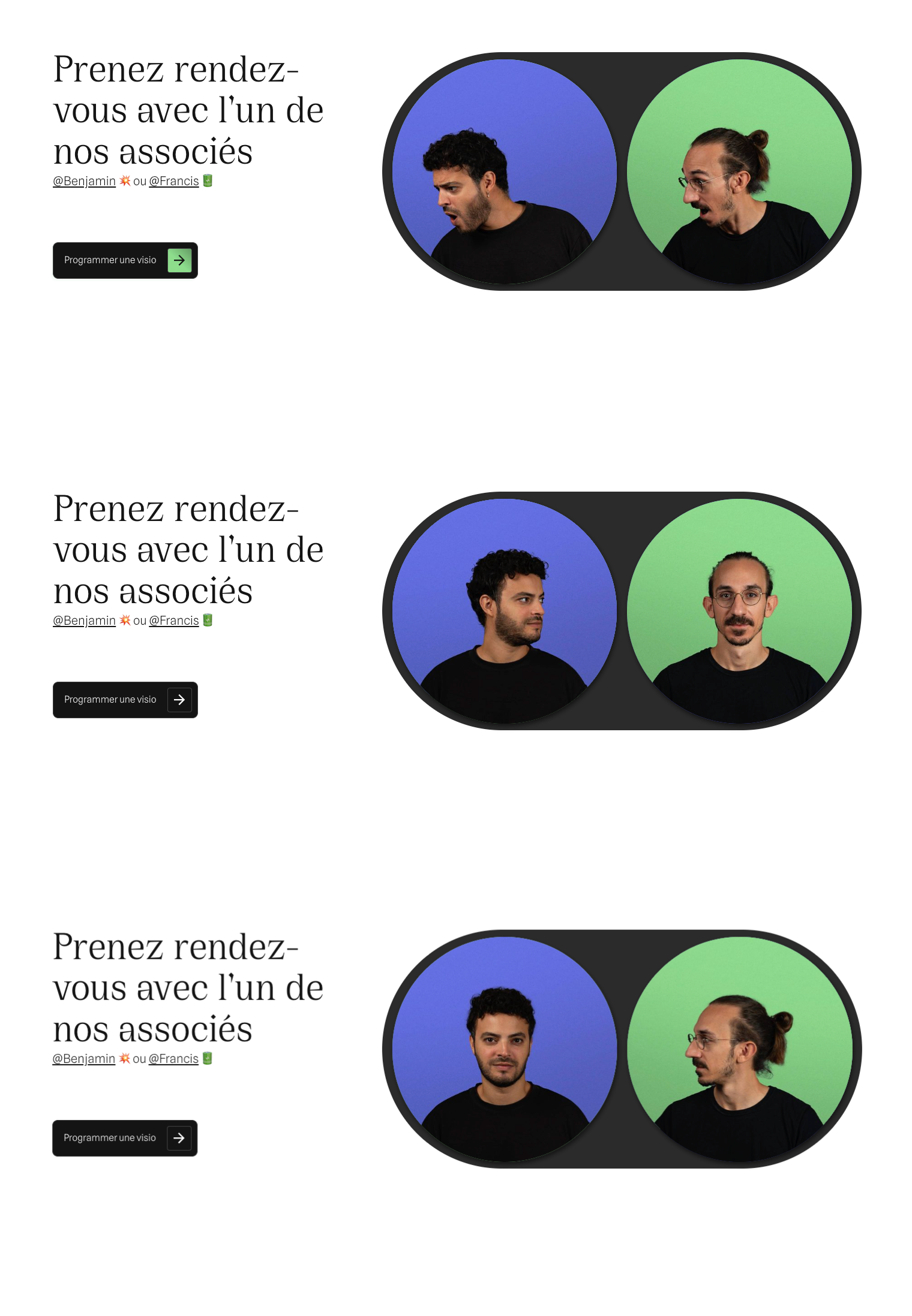
And yet, there’s no complex 3D rendering, no hundreds of lines of code, or extravagant effects. Just two cool guys at the end of the site, casually looking at something, which naturally draws attention and entices visitors to explore that section further.
404 Mini Escape-Game
The 404 page was something we discussed right from our very first meeting. Usually, it’s the kind of page that gets thrown together at the last minute. But as soon as I saw the creative direction, I knew I wanted to have some fun with it—especially since the team gave me complete creative freedom.
The entire site is filled with unique call-to-actions and micro-interactions, so I thought, why not take that concept to the next level on the 404 page?
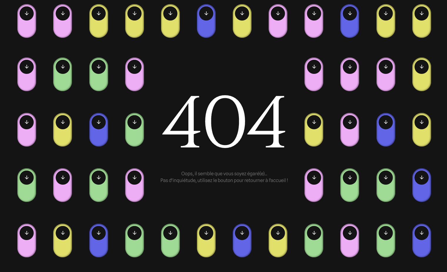
The idea was to turn the 404 page into a mini “maze,” where visitors have to find their way back to the homepage. There are multiple buttons, each reacting based on how many clicks the visitor has made. I couldn’t just have a single active button—if someone clicks all the wrong ones before finding the right one, they might get frustrated and leave the site for good. So, the challenge was to keep it engaging without making it too frustrating.
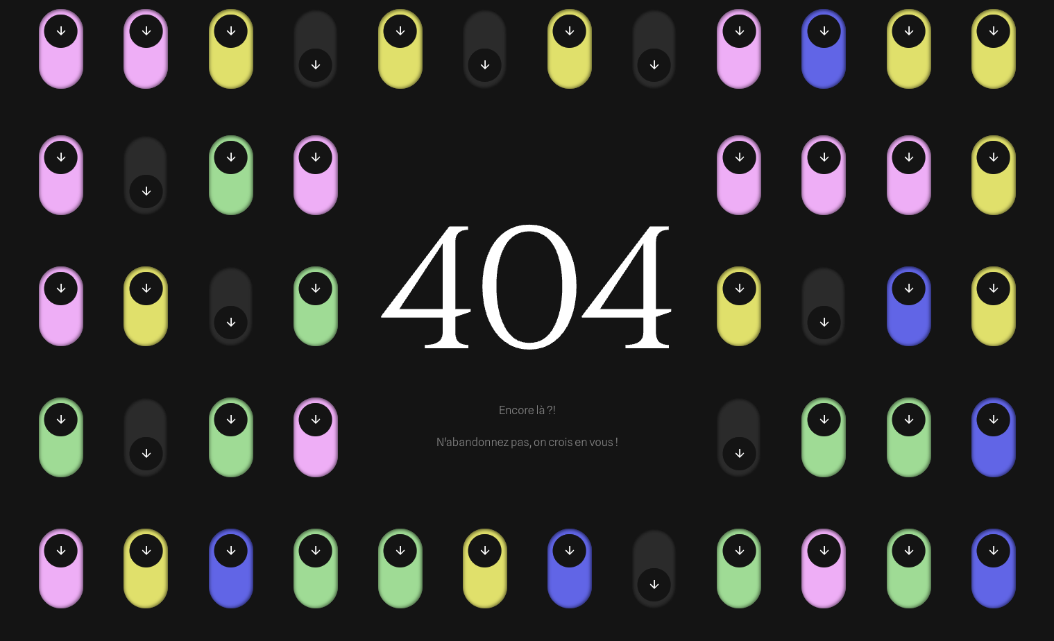
Do you want to try escaping the 404 page? 🙂
Stack & Tech
- Webflow: Serves as the CMS, ensuring easy content management and updates.
- Node.js & Vite.js: Core development environment for the project.
- Vanilla JavaScript: No frameworks—keeping it lightweight and custom.
- GSAP: Used for scroll triggers and specific click animations.