
By definition, an interface is a layer between the user and a system, serving the purpose of communication between them. Interacting with the interface usually requires users to perform certain actions.
Different actions can lead to various outcomes, some of which might be critical.
While we often need to provide additional protection in case users attempt to perform dangerous or irreversible actions, It’s good to remember that one of the ten usability heuristics called “Error Prevention” says:
“Good error messages are important, but the best designs carefully prevent problems from occurring in the first place. Either eliminate error-prone conditions or check for them and present users with a confirmation option before they commit to the action.”
What Is A Dangerous Action?
Surprisingly, when we talk about dangerous actions, it doesn’t necessarily mean that something is being deleted.
Here’s an example of a dangerous action from the banking application I use:
The bank approved a loan for me, and as soon as I clicked “Get Money,” it meant that I had signed the necessary documents and accepted the loan. All I have to do is tap the yellow button, and I’ll get the money.
As a result of an accidental tap, you might end up taking a loan when you didn’t intend to, which is why this action can be considered significant and dangerous.
Therefore, a dangerous action does not necessarily mean deleting something.
Some examples may include the following:
- Sending an email,
- Placing an order,
- Publishing a post,
- Making a bank transaction,
- Signing a legal document,
- Permanently blocking a user,
- Granting or revoking permissions.
Ways To Confirm Dangerous Actions
There are many methods to prevent users from losing their data or taking irreversible actions unintentionally. One approach is to ask users to explicitly confirm their actions.
There are several ways to implement this, each with its own pros and cons.
Modal Dialogs
First of all, we should understand the difference between modal and non-modal dialogs. It’s better to think about modality state since dialogs, popups, alerts — all of these might be presented either in the modal state or not. I will use the term dialogs as a general reference, but the keyword here is modality.
“Modality is a design technique that presents content in a separate, dedicated mode that prevents interaction with the parent view and requires an explicit action to dismiss.”
— Apple design guides
Modal dialogs require immediate user action. In other words, you cannot continue working with an application until you respond in some way.
Non-modal dialogs, on the other hand, allow you to keep using the application without interruption. A common example of a non-modal element is a toast message that appears in the corner of the screen and does not require you to do anything to continue using the app.
When used properly, modal dialogs are an effective way to prevent accidental clicks on dangerous actions.
The main problem with them is that if they are used to confirm routine actions (such as marking a task as done), they can cause irritation and create a habit of mindlessly confirming them on autopilot.
However, this is one of the most popular methods. Besides, it can be combined with other methods, so let’s dive into it deeper.
When To Use Them
Use modal dialogs when a user action will have serious consequences, especially if the result of the action is irreversible. Typical cases include deleting a post or project, confirming a transaction, and so on.
It depends on what kind of action users want to take, but the main thing to keep in mind is how serious the consequences are and whether the action is reversible or not.
Things To Keep In Mind
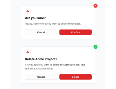
- Avoid vague language.
If you ask users, “Are you sure?” chances are, they will not have any doubts. - In the title, specify what exactly will happen or which entity will be affected (e.g., project name, user name, amount of money).
- Provide an icon that indicates that the action is dangerous.
It both increases the chances that users will not automatically confirm it and is good for accessibility reasons (people with color blindness will notice the icon even if it appears grey to them, signaling its importance). - In the description, be specific and highlight the necessary information.
- The CTA button should also contain a word that reflects the action.
Instead of “Yes” or “Confirm,” use more descriptive options like “Delete,” “Pay $97,” “Make Transaction,” “Send Message,” and so on — including the entity name or amount of money in the button is also helpful. Compare: “Confirm” versus “Pay $97.” The latter is much more specific.
However, this might not be enough.
In some cases, you may require an extra action. A typical solution is to ask users to type something (e.g., a project name) to unblock the CTA button.
Here are a few examples:
ConvertKit asks users to type “DO IT” when removing subscribers.
Pro tip: Note that they placed the buttons on the left side! This is a nice example of applying proximity law. It seems reasonable since the submit button is closer to the form (even if it consists of only one input).

Resend asks users to type “DELETE” if they want to delete an API key, which could have very serious consequences. The API key might be used in many of your apps, and you don’t want to break anything.
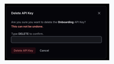
This modal is one of the best examples of following the best practices:
- The title says what the action is (“Delete API Key”).
- In the text, they mentioned the name of the API Key in bold and in a different color (“Onboarding”).
- The red label that the action can not be undone makes it clearer that this is a serious action.
- Extra action is required (typing “DELETE”).
- The CTA button has both a color indicator (red usually is used for destructive actions) and a proper label — “Delete API Key”. Not a general word, e.g., “Confirm” or “Delete.”
Notice that Resend also places buttons on the left side, just as ConvertKit does.
Note: While generally disabling submit buttons is considered bad practice, this is one of the cases where it is acceptable. The dialog’s request is clear and straightforward both in ConvertKit and Resend examples.
Moreover, we can even skip the submit button altogether. This applies to cases where users are asked to input an OTP, PIN, or 2FA code. For example, the bank app I use does not even have a log in button.
On the one hand, we still ask users to perform an extra action (input the code). On the other hand, it eliminates the need for an additional click.

Accessibility Concerns
There is ongoing debate about whether or not to include a submit button when entering a simple OTP. By “simple,” I mean one that consists of 4-6 digits.
While I am not an accessibility expert, I don’t see any major downsides to omitting the submit button in straightforward cases like this.
First, the OTP step is typically an intermediate part of the user flow, meaning a form with four inputs appears during some process. The first input is automatically focused, and users can navigate through them using the Tab key.
The key point is that, due to the small amount of information required (four digits), it is generally acceptable to auto-submit the form as soon as the digits are entered, even if a mistake is made.
On the one hand, if we care about accessibility, nothing stops us from providing users control over the inputs. On the other hand, auto-submission streamlines the process in most cases, and in the rare event of an error, the user can easily re-enter the digits.
Danger Zones
For the most critical actions, you may use the so-called “Danger zone” pattern.

A common way to implement this is to either have a dedicated page or place the set of actions at the bottom of the settings/account page.
It might contain one or more actions and is usually combined with other methods, e.g., a modal dialog. The more actions you have, the more likely you’ll need a dedicated page.

When To Use Them
Use a Danger Zone to group actions that are irreversible or have a high potential for data loss or significant outcomes for users.
These actions typically include things like account deletion, data wiping, or permission changes that could affect the user’s access or data.
Things To Keep In Mind
- Use colors like red, warning icons, or borders to visually differentiate the Danger Zone from the rest of the page.
- Each action in the Danger Zone should have a clear description of what will happen if the user proceeds so that users understand the potential consequences.
- Ask users for extra effort. Usually, the actions are irreversible and critical. In this case, you may ask users to repeat their password or use 2FA because if someone else gets access to the page, it will not be that easy to do the harmful action.
- Keep only truly critical actions there. Avoid making a danger zone for the sake of having one.
Inline Guards
Recently, I discovered that some apps have started using inline confirmation. This means that when you click on a dangerous action, it changes its label and asks you to click again.
This pattern is used by apps like Zapier and Typefully. While at first it seems convenient, it has sparked a lot of discussion and questions on X and Linkedin.
When To Use Them
This is for non-critical actions that might be accidentally executed, usually due to a misclick.
There was a concern mentioned by the community of designers regarding the case of users still being able to execute the action by double-clicking.
However, there are three things to consider:
- This kind of confirmation is convenient for actions that are not dangerous, but at the same time, it’d be better to ask for an extra effort.
- Ideally, we should provide an option to undo the action or push the deleted item to an archive page (in case we delete something). This is a good combination to make sure that users are safe.
- The purpose of inline confirmation is to prevent accidental clicks, contrasting with cases where we alert users to the serious consequences of their actions.
Even though the Jakob’s law says that
“Users spend most of their time on other sites. This means that users prefer your site to work the same way as all the other sites they already know.”
It doesn’t mean that you cannot facilitate the usage of an app by introducing new patterns. Otherwise, the web wouldn’t evolve at all.

I’ve seen attempts to try to fix accidental double-clicking by changing the position of the inline confirmation label that appears after the first click.
But this creates layout shifts. When users work with the app daily, it may cause more irritation than help.
As an option, we can solve this issue by adding a tiny delay, e.g., 100-200ms, to prevent double-clicking.
It also matters who your users are. Remember the good old days when we used to click a dozen times to launch Internet Explorer and ended up with dozens of open instances?
If your target audience is likely to do this, apparently, the pattern will not work.
However, for apps like Zapier or Typefully, my assumption is that the target audience might benefit from the pattern.
Two-factor Authorization Confirmation
This method involves sending a confirmation request, with or without some kind of verification code, to another place, such as:
- SMS,
- Email,
- Authenticator app on mobile,
- Push notifications (e.g., instead of sending SMS, you may choose to send push notifications),
- Messengers.
Notice: I’m not talking about authentication (namely, login process), but rather a confirmation action.
An example that I personally face a lot is an app for sending cryptocurrency. Since this is a sensitive request, apart from submitting the requisition from a website, I should also approve it via email.

When To Use It
It can be used for such operations as money transfers, ownership transfers, and account deletion (even if you have a danger zone). Most of us use this method quite often when we pay online, and our banks send us OTP (one-time password or one-time code).
It may go after the first initial protection method, e.g., a confirmation dialog.
As you can see, the methods are often combined and used together. We should not consider each of them in isolation but rather in the context of the whole business process.
Passkeys
Passkeys are a modern, password-less authentication method designed to enhance both security and user experience.
“Passkeys are a replacement for passwords. A password is something that can be remembered and typed, and a passkey is a secret stored on one’s devices, unlocked with biometrics.”
— passkeys.dev
There are a few pros of using passkeys over 2FA, both in terms of security and UX:
- Unlike 2FA, which typically requires entering a code from another device or app (e.g., SMS or authenticator apps), passkeys streamline the confirmation process. They don’t require switching between devices or waiting for a code to arrive, providing immediate authentication.
- While 2FA provides extra protection, it is vulnerable to phishing, SIM-swapping, or interception. Passkeys are much more resistant to such attacks because they use public-private key cryptography. This means no secret code is ever sent over the network, making it phishing-resistant and not reliant on SMS or email, which can be compromised.
- Passkeys require less mental effort from users. There’s no need to remember a password or type a code — just authenticate with a fingerprint, facial recognition, or device-specific PIN. This way, we reduce cognitive load.
- With passkeys, the authentication process is almost instant. Unlike 2FA, where users might have to wait for a code or switch to another device, passkeys give us the opportunity to confirm actions without switching context, e.g., opening your email inbox or copying OTP from a mobile device.
The passkeys are widely supported and more and more companies adopt it.

Second-person Confirmation
This is a mechanism when two users are involved in the process. We may call them initiator and approver.
In this case, the initiator makes a request to take some action while the approver decides whether to confirm it or not.
In both roles, a confirmation dialog or other UI patterns may be used. However, the main idea is to separate responsibilities and decrease the probability of a bad decision.
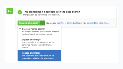
Actually, you have likely encountered this method many times before. For example, a developer submits a pull request, while a code reviewer decides whether to confirm it or decline.
When To Use It
It is best suited for situations when the seriousness of decisions requires few people involved.
There is a direct analogy from real life. Take a look at the picture below:

The Council of Physicians reminds us that in medicine, seeking a second opinion is crucial, as collaboration and diverse perspectives often result in more informed decisions and better patient care. This is a perfect example of when a second opinion or an approver is essential.
Here, you will find some apps that use this method:
- GitHub, as previously mentioned, for merging pull requests.
- Jira and other similar apps. For example, when you move issues through a certain workflow stage, it may require manager approval.
- Banking applications. When you make a high-value transaction, it could be necessary to verify it for legal issues.
- Deel, which is a global hiring and payroll. One part (e.g., employer) draws up a contract and sends it to another part (e.g., freelancer), and the freelancer accepts it.
But here is the thing: We can consider it a separate method or rather an approach for implementing business logic because even if another person confirms an action, it is still a dangerous action, with the only difference being that now it’s another person who should approve it.
So, all of the examples mentioned above are not exactly a standalone specific way to protect users from making wrong decisions from the UI point of view. It’s rather an approach that helps us to reduce the number of critical mistakes.
Do We Actually Need To Ask Users?
When you ask users to take action, you should be aware of its original purpose.
The fact that users make actions does not mean that they make them consciously.
There are many behavioral phenomena that come from psychology, to name a few:
- Cognitive inertia: The tendency of a person to stick to familiar decisions, even if they are not suitable for the current situation. For instance, the vast majority of people don’t read user agreements. They simply agree with the lengthy text because it’s necessary from the legal point of view.
- Availability Heuristic: People often make decisions based on information that is easily accessible or familiar to them rather than making a mental effort. When users see the same confirmation popups, they might automatically accept them based on their previous successful experience. Of course, sooner or later, it might not work, and the acceptance of required action can lead to bad consequences.
- Cognitive Miser: The human mind is considered to be a cognitive miser due to the tendency of humans to think and solve problems in simpler and less effortful ways rather than in more sophisticated and effortful ways, regardless of intelligence. This explains why many users just click “yes” or “agree” without carefully reading the text.
- Quite a representative example is banner blindness, even though not related to confirmation but, in fact, revolves around the same human behavior idiosyncrasies.
A reasonable question that may arise: What are the alternatives?
Even though we cannot entirely affect users’ behavior, there are a few tactics we can use.
Delaying
In some scenarios, we can artificially delay the task execution in a graceful way.
One of my favorite examples is an app called Glovo, which is a food delivery app. Let’s have a look at the three screens you will see when you order something.
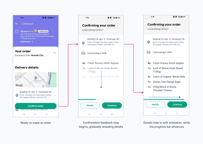
The first screen is a cart with items you chose to buy (and an annoying promotion of subscription that takes ⅓ of the screen).
After you tap the “confirm order” button, you’ll see the second screen, which asks you whether everything is correct. However, the information appears gradually with fade-in animation. Also, you can see there is a progress bar, which is a fake one.
After a few seconds, you’ll see another screen that shows that the app is trying to charge your card; this time, it’s a real process. After the transaction proceeds, you’ll see the status of the order and approximate delivery time.
Pro tip: When you show the status of the order and visually highlight or animate the first step, it makes users more confident that the order will be completed. Because of the trick that is called Goal-Gradient Effect.
You’ve just paid, and “something starts happening” (at least visually), which is a sign that “Oh, they should have already started preparing my order. That’s nice!”

The purpose of the screen with a fake progress bar is to let users verify the order details and confirm them.
But this is done in a very exquisite way:
- On the first screen, you click “confirm order”. It doesn’t invoke any modals or popups, such as “Are you sure?”.
- On the second screen, users can see how information about their order appears right away, and the scroll bar at the bottom goes further. It seems like that app is doing something, but it’s an illusion. An illusion that makes you take another quick look at what you’ve just ordered.
In the previous version of the app, you couldn’t even skip the process; you could only cancel it. Now they added the “Continue” button, which is essentially “Yes, I’m sure” confirmation.
This means that we return back again to the drawbacks of classic confirmation modals since users can skip the process. But the approach is different: it’s a combination of a feedback loop from the app and skipping the process.
This combination makes users pay attention to the address, order, and price at least sometimes, and it gives them time to cancel the order, while in the classic approach, the confirmation is “yes or no?” which is more likely to be confirmed right away.
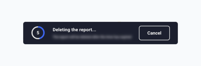
The Undo Option
The undo pattern allows users to reverse an action they have just performed, providing a safety net that reduces anxiety around making mistakes.
Unlike confirmation modals that interrupt the workflow to ask for user confirmation, the undo pattern provides a smoother experience by allowing actions to be completed with the option to reverse them if needed.
When To Use It
It works perfectly fine for non-destructive, reversible actions &mdashl actions that don’t have significant and immediate consequences:
- Reversing actions when editing a document (The beloved ctrl + z shortcut);
- Removing a file (if it goes to the trash bin first);
- Changing the status of a task (e.g., if you accidentally marked a task completed);
- Deleting a message in a chat;
- Applying filters to a photo.
Combined with a timer, you can extend the number of options since such tasks as sending an email or making a money transfer could be undone.
When You Cannot Use It
It’s not suitable for actions that have serious consequences, such as the following:
- Deleting an account;
- Submitting legal documents;
- Purchasing goods (refund is not the same as the undo option);
- Making requests for third-party APIs (in most cases).
How To Implement Them?
- The most common way that most people use every day is to provide a shortcut (ctrl + z). However, it’s constrained to some cases, such as text editors, moving files between folders, and so on.
- Toasts are probably the most common way to implement these web and mobile apps. The only thing that you should keep in mind is that it should stand out enough to be noticed. Hiding them in a corner with a tiny message and color that is not noticeable might not work — especially on wide screens.
- A straightforward solution is simply to have a button that does the undo option. Preferably close to the button that evokes the action that you want to undo.
The undo option is tightly related to the concept called soft deleting, which is widely used in backend frameworks such as Laravel.
The concept means that when users delete something via the UI, it looks like it has been deleted, but in the database, we keep the data but mark it as deleted. The data is not lost, which is why the undo option is possible since we don’t actually delete anything but rather mark it as deleted.
This is a good technique to ensure that data is never lost. However, not every table needs this.
For example, if you delete an account and don’t want users to restore it (perhaps due to legal regulations), then you should erase the data completely. But in many cases, it might be a good idea to consider soft deleting. In the worst case, you’ll be able to manually restore user data if it cannot be done via the UI for some reason.
Conclusion
There’s something I want everyone to keep in mind, regardless of who you are or what you do.
Every situation is unique. A certain approach might work or fail for a variety of reasons. You might sometimes wonder why a specific decision was made, but you may not realize how many times the interface was revised based on real user feedback.
User behavior is affected by many factors, including country, age, culture, education, familiarity with certain patterns, disabilities, and more.
What’s crucial is to stay in control of your data and users and be prepared to respond when something goes wrong. Following best practices is important, but you must still verify if they work in your specific case.
Just like in chess, there are many rules — and even more exceptions.
Further Reading
(yk)