This healthier gluten free potato salad is perfect for picnics and barbecues. Replacing potato with cauliflower is a Low Carb Diet trick I learned a decade and a half ago.
No Potato Salad
Have you made potato salad using cauliflower instead of potatoes?
Swapping in cauliflower, a fiber rich food, results in a far more nutrient dense gluten free potato salad that’s also low carb.
The low carb diet has worked well for me because it burns fat, stabilizes blood glucose levels, and incorporates so many nutrient rich foods.
Low Carb Recipes
Along those lines, the health benefits of a low carb diet are plentiful.
What Is Low Carb Food?
What is low carb food? I focus on consuming protein, along with low glycemic vegetables, and fat while eliminating high carb processed foods.
Get My Keto Recipes eBook
Free exclusive eBook, plus recipes and health tips, delivered to your inbox.
Cauliflower Potato Salad
In my cauliflower potato salad, I trade high carb potatoes for fiber rich, nutrient dense cauliflower.
These types of win-win swaps and nutritionally dense unlocks are key to my cooking!
Cauliflower Recipes
When it comes to low carb vegetarian recipes, my No Potato Salad checks all the boxes –easy, healthy, and delicious.
Ready to eat in just twenty minutes, and a busy mom’s dream, my favorite cruciferous vegetable, cauliflower, is the star of the show here.
Cauliflower Carbs
Calories
Carbs
Fiber
Net Carbs
Protein
Fat
Cauliflower (1 cup)
27
5g
3g
2g
2g
0g
Cauliflower is a fantastic superfood that I eat regularly in a variety of ways.
High Fiber Food
Naturally high in fiber and vitamins B and C, it also contains phytonutrients and glucosinolates that help protect against cancer.
Cauliflower Rice Recipes
This versatile vegetable is also an optimal swap for high carb rice. Here are some of my cauliflower rice recipes:
No Potato Salad
Print
Email
Pin Recipe
Instructions
Chop cauliflower into small florets (½ inch)
Steam cauliflower on the stove until fork-tender, not more or a stronger “cauliflower” smell develops
Allow cauliflower to cool then place in a large bowl
Add celery, onion, parsley and egg
Stir in mayonnaise, mustard and salt
Serve
Prep Time 10 minutesmins
Cook Time 10 minutesmins
Total Time 20 minutesmins
Prevent your screen from going dark
Celiac Disease Self Care
Wondering how it all started? Living the life of a gluten free pioneer hasn’t always been easy.
I was diagnosed with celiac disease in 1998, and at that point, gluten free recipes were incredibly hard to find.
I knew I’d need to create my own.
Gluten Free Recipes
Another issue? So many gluten free recipes use unhealthy ingredients.
For example, the majority of gluten free breads and baked goods are made with high carb ingredients such as rice flour, potato starch, and corn meal.
Since I’m conscious of the advantages of gluten free and low carb diets, I use flours and ingredients that are full of healthy fat, fiber, and protein.
Is Potato Salad Gluten Free?
You don’t have to ask is potato salad gluten free with my No Potato Salad because, yes, it’s gluten free and it’s low carb, too!
Low Carb Dinner Ideas
Here are more of my healthy gluten free recipes for you and yours to enjoy.
They’re far healthier and more nourishing than their Standard American Diet (SAD) counterparts, but just as tasty.
Whether you need a recipe for vegetable salad, easy dinner recipes with chicken, or easy recipes for dessert, I’ve got you covered below with plenty of simple solutions for healthy eating.
Rosemary Chicken with Lemon
This fresh and flavorful marinade for chicken recipe has hints of garlic, fragrant rosemary, and zesty lemon.
A few minutes on the grill, and you’ll be serving savory Rosemary Chicken with Lemon for dinner.
After one bite, this recipe for grilled chicken breast will become part of your regular rotation.
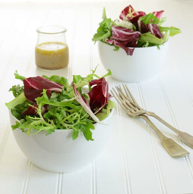
Fresh Friseé Salad
The best salads are those thrown together with whatever fresh leafy vegetables I have on hand from the garden or farmers’ market, but this one is so good we make it again and again.
This colorful and nutrient rich salad with radicchio, friseé, butter lettuce, and arugula is also next level delicious because of my homemade salad dressing recipe.
Shaken together with ease, the dijon mustard and red wine vinegar are the tangy cherry (tomato) on top of this Fresh Friseé Salad.
Asparagus Salad with Tomatoes and Basil
When you’re looking for an asparagus recipe, salad doesn’t always come to mind. This keto side dish is full of fresh garden ingredients and can be prepared in under 15 minutes.
My Asparagus Salad with Tomatoes and Basil complements any entree, and for those of you with a nightshade allergy, it’s every bit as delicious if you leave out the tomatoes.
Fruit Salad Recipe
When you have a fruit salad recipe that’s so simple to pull together, the hardest part is deciding on the fruit medley to use.
I often prepare my Simple Fruit Salad with organic yogurt, adding a bit of vanilla. The combinations are endless and the result, deliciously healthy.
Ice Cream Sandwich Recipe
My recipe for the best chocolate chip cookies along with vegan vanilla ice cream that’s homemade is a match made in heaven!
My Ice Cream Sandwich recipe has been a family favorite since the boys were little.
Back in the day, I made assembling these healthy frozen treats an interactive activity for the boys and their friends, setting out a toppings bar with gluten free sprinkles, coconut flakes, chopped nuts, mini chocolate chips, and more to coat them.
This activity was a huge hit at our end of the season baseball parties and is one of my absolute favorite recipes for summer, but it’s so incredible we make it all year round!
Firecracker Popsicles Red White and Blue
The best way to cool down on a hot day? A healthy homemade popsicle!
Simple and refreshing, my Firecracker Popsicles Red White and Blue are made with 4 all natural ingredients, –coconut milk, strawberries, blueberries, and honey.
For a low carb pop, swap out the honey for Swerve.
Take note though, Swerve is a low carb keto sweetener that’s not on the menu for me. To find out why read What’s the Best Sweetener for the Keto Diet.
BBQ Recipes
The season is upon us for outdoor gatherings and celebrations.
I hope one of these delicious and nutritious recipes I shared will be at your next BBQ with healthy sides. Need more inspiration? Check out my Gluten Free BBQ menu!
This No Potato Salad recipe is an oldie but goodie from the archives. I first shared it in 2009.
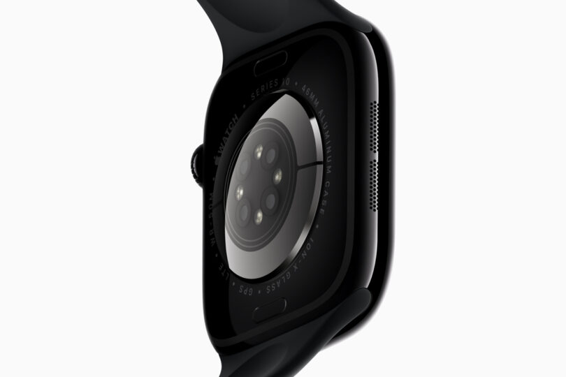
Apple is making the Apple Watch even better than before. The new Apple Watch Series 10 has been announced, and while it doesn’t necessarily redefine the Apple Watch experience as far as features go, it does refine the Apple Watch design in a few key, meaningful ways.
In fact, the design changes to the Apple Watch Series 10 could be the best thing about the new model. Sure, that might not be enough of a reason to upgrade from the Series 9, but if you’re in the market for a new smartwatch, you can expect the best-looking Apple Watch ever.
The changes to the device can be split into two buckets: build and display. Here’s a look.
Build and Bands
The overall shape of the watch is largely the same for the Series 10, but with a few meaningful changes. The most important of these relates to thickness. The Apple Watch Series 10 is the thinnest Apple Watch yet, making it look sleeker and more stylish while offering a more comfortable fit. It’s almost 10% thinner than the Series 9 before it, while retaining the same set of features and the same battery life. That’s a pretty impressive feat.
Along with the thinner build, the device is also available in an array of colors, including a sleek new jet black polished aluminum finish. There’s also silver aluminum or rose gold aluminum, or you can spend more for polished titanium, which comes in natural titanium, gold titanium, and slate titanium.
Hermès Grand H band
There are a ton of new Apple Watch bands on offer too, including some made by Hermès. Apple now offers Milanese Loop and Link Bracelet bands, color-matched to the titanium cases of the Series 10. Along with that, there’s a new Torsade cable knit band from Hermès, as well as a Twill Jump Attelage band that’s built to offer a silky feel. Last but not least is the Grand H Hermès band, which is Hermès’ first metal Apple Watch band, made of a series of interlocking links in satin-finished stainless steel.
Hermès Twill Jump Attelage band
Hermès Torsade band
Display
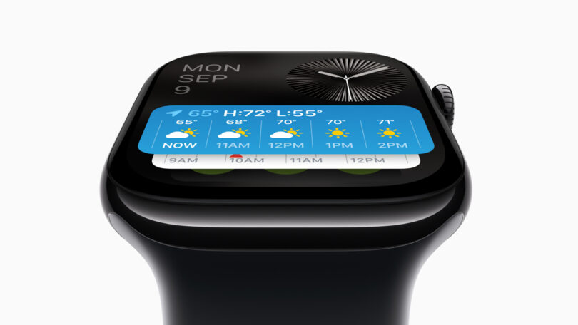
Perhaps even more important than the thinner build is the new display technology on the device. There are basic improvements, like the fact that the display is now larger with thinner bezels around it, making for a more modern look. In fact, the display on the larger 46mm model is even bigger than the screen on the Apple Watch Ultra 2. That can be helpful for reading text, for example.
Even more important than that, though, is the fact that this is the first Apple Watch with a wide-angle OLED display. This tech is designed to allow you to more easily see what’s on the screen when you’re not looking at the watch face-on. So, you can glance down at your watch subtly to check the time or see a notification without having to raise or move your wrist. The display is up to 40% brighter than the Series 9 when viewed at an angle, though we’ll have to wait and see how that translates to real-world use.
Other Stuff
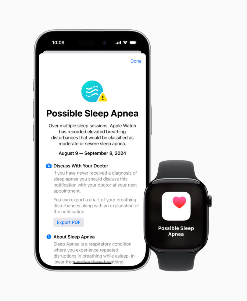
There are other improvements to the Apple Watch Series 10 as well, unrelated to the design. For starters, the new device has some new health tracking features, including the ability to detect possible sleep apnea. That can be pretty helpful, considering the fact that a large percentage of sufferers of sleep apnea go undiagnosed, and the fact that sleep apnea can have a massive impact on overall sleep quality.
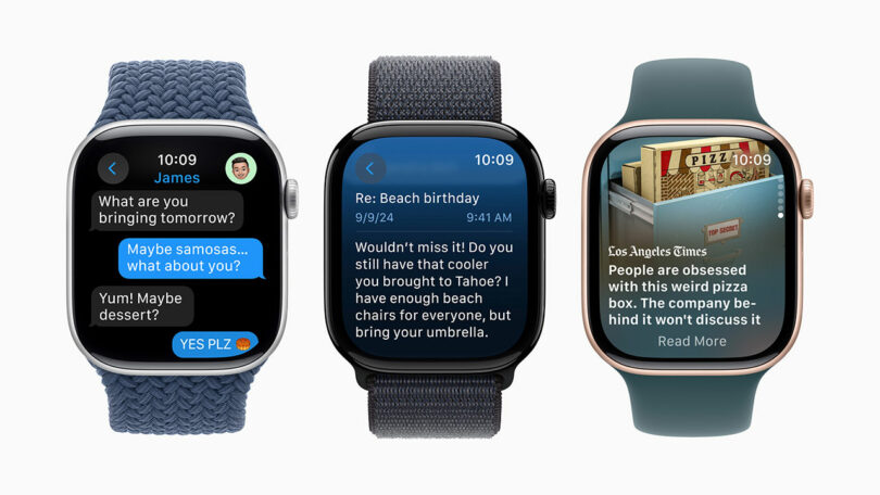
Other features include the ability to play music or podcasts through the built-in speakers, and faster charging, which allows the device to charge to 80% battery in around 30 minutes. That’s very helpful for those who use their device at night for sleep tracking, as it allows them to top up on battery before bed or when they wake up.
The Apple Watch Series 10 is now up for pre-order, with sales set to begin on September 20th. The device starts at $399 for the smaller 42mm model with an aluminum finish. Prices range up from there for the larger variant, a more expensive finish, or a cellular connection.
Christian de Looper is a consumer tech reporter based in sunny Santa Cruz, California. Christian has reported on tech for over 10 years, with bylines in many of the largest tech publications, including Digital Trends, Forbes, CNN Underscored, Tom’s Guide, and PCMag. Christian has an obsession with how tech companies balance great design with great functionality, and lives at home with his wife, daughter, and cat.
As computer vision researchers, we believe that every pixel can tell a story. However, there seems to be a writer’s block settling into the field when it comes to dealing with large images. Large images are no longer rare—the cameras we carry in our pockets and those orbiting our planet snap pictures so big and detailed that they stretch our current best models and hardware to their breaking points when handling them. Generally, we face a quadratic increase in memory usage as a function of image size.
Today, we make one of two sub-optimal choices when handling large images: down-sampling or cropping. These two methods incur significant losses in the amount of information and context present in an image. We take another look at these approaches and introduce $x$T, a new framework to model large images end-to-end on contemporary GPUs while effectively aggregating global context with local details.
Launch Roundup: Falcon 9 and Electron to extend satellite constellations – NASASpaceFlight.com
We use cookies to ensure that we give you the best experience on our website. If you continue to use this site we will assume that you are happy with it.OkRead more
Sean “Diddy” Combs has been arrested and taken into federal custody.
RELATED: Explained: Sean “Diddy” Combs & The Unsettled Sexual Assault Lawsuits Against Him
Diddy Is Arrested & Taken Into Federal Custody
On Monday, September 16, TMZ published an exclusive report citing that sources informed the outlet Diddy had been taken into federal custody.
According to the outlet, Homeland Security entered a hotel in midtown New York where Diddy was staying. Authorities are now reportedly searching his hotel room. Meanwhile, the 54-year-old music mogul has reportedly been taken into custody at the FBI field office.
Furthermore, the outlet reports that the music mogul’s arrest was made in connection to an ongoing sex trafficking investigation. Additionally, TMZ notes that “other offenses” also contributed to the current development.
According to the outlet, a grand jury has been hearing from eyewitnesses about Diddy’s alleged actions. Diddy’s arrest now reportedly marks his official indictment.
Meanwhile, Marc Agnifilo, an attorney representing the music mogul, has since released a statement.
Swipe below to read his words.
Social Media Reacts
Per TMZ, Diddy’s arrest was reportedly scheduled for Tuesday, September 17. However, a recent development “caused the feds to move in a day earlier.” Meanwhile, social media users are sharing a plethora of reactions to the recent update involving the 54-year-old.
Instagram user @papi.pharaoh wrote, “One thing I learn about the feds, they’re not coming to arrest you unless they have more than enough evidence to hold you.”
While Instagram user @mannysolo added, “‘Bad Boys For LIFE’ just hits different”
Instagram user @mashondatifrere wrote, “Everything done in the dark comes to light. 💡”
While Instagram user @candace0183 added, “At the end of the day…the day gotta end 🤷🏽♀️”
Instagram user @angeltrensetta wrote, “Never thought I would see the down fall of Diddy. Smh”
Here’s What’s Recently Happened With Diddy
As The Shade Room previously reported, the music mogul made headlines in November 2023 when his ex-girlfriend, Casandra “Cassie” Ventura accused him of sexual trafficking, abuse, and assault. The pair ultimately settled the suit privately as Diddy denied the accusations from his former partner.
In the months that followed, the music mogul became the subject of a plethora of lawsuits and allegations. Some accused the producer and rapper of group sexual assault, while another accused him of sexual assault and harassment against a former employee.
In March, Diddy’s homes were raided by federal authorities, reportedly in connection to an “ongoing investigation.”
RELATED: What’s Going On With Diddy? Everything To Know Following His Multi-Home Federal Raids
Then, in May, footage surfaced of Diddy assaulting Cassie in a California hotel hallway in March 2016, per The Shade Room. In the footage, Diddy could be seen running down a hallway in pursuit of Cassie. Additionally, he’s seen throwing her to the floor, kicking her, and throwing objects in her direction.
Later that month, Diddy posted a video message apologizing to the public for his actions, per The Shade Room. In the clip, the music mogul explained that he “hit rock bottom” and his behavior was “inexcusable.”
Furthermore, in May, reports initially surfaced asserting that a grand jury had been composed to hear from the producer’s alleged sexual misconduct victims, per The Shade Room.
Most recently, Diddy has been sued for sexual abuse by his former Bad Boy artist and Diddy—Dirty Money bandmate, Dawn Richard. Richard alleges that she witnessed the music mogul’s abuse of Cassie. Additionally, Richard even asserted that Diddy initiated inappropriate conduct with her.
Richard has not spoken out since the news of her filing went public. However, she and Diddy’s bandmate Kalenna Harper have shared her own perspective on Richard’s lawsuit. Furthermore, per Rolling Stone, the music mogul has reportedly denied the allegations listed in each case against him.
RELATED: UPDATE: Kalenna Harper Reacts To Abuse Allegations & Being Mentioned In Dawn Richard’s Lawsuit Against Diddy
Emily Gold, a cheerleader who attended Los Osos High School in California and who appeared just last month on America’s Got Talent, was found dead by suicide on Friday, September 20.
She was 17 years old.
Emily Gold is pictured here as part of her GoFundMe Page. May she rest in peace. (GoFundMe)
According to the San Bernardino Coroner’s Office, Gold’s body was found under a bridge on the eastbound 210 Highway in Rancho Cucamonga.
Hence why officials are confident that the teenager took her own life.
Along with other members of the Los Osos High School dance team, Gold impressed judges a few weeks ago on America’s Got Talent.
After making it through auditions, the group earned a spot in to the program’s quarterfinals before they were eliminated in August.
“It was absolutely brilliant,” panelist Simon Cowell said of the performance at the time. “What I loved about this was first of all the energy. I think what I just saw is everything a great school should be doing, which is encouraging talent and friendship.”
Added the picking judge:
“It reminded me of seeing the High School Musical movie and thinking every kid should go to a school like that.”
A GoFundMe campaign is underway in Gold’s honor and has already raised nearly half of its $50,000 target, with the money donated meant to be sent to Emily’s grieving family.
“Let it be known that she now rests easy although there were many that loved Emily Gold and even looked up to her,” a friend wrote on Facebook of Gold.
“She will be remembered none the less by her fellow Grizzlies and by those who loved her with all their heart and soul. Emily Gold, thank you for all that you have done in this world. You have done more than enough. Claws up to you Emily. Claws up.”
Emily Gold and her friends take to the stage here on America’s Got Talent. (NBC)
Back on August 13, Gold even spoke to People Magazine of her run as a reality star.
“When I’m performing, I’m really thinking about all the corrections because we get corrections up until five minutes before we go on stage,” she told this outlet.
“So to really just think about all those so that we apply them is my biggest priority on stage.”
We send our condolences to the friends, family members and loved ones of Emily Gold.
If you or someone you know is considering suicide, please contact the 988 Suicide and Crisis Lifeline by dialing 988, text “STRENGTH” to the Crisis Text Line at 741741 … or go to 988lifeline.org.
Bringing data to life in your application can be done without the usual headaches. Paul Scanlon shows you how you can build beautiful data visualizations using the Google Analytics API, and you won’t have to spend any time “massaging” the data.
In this article, I’ll introduce you to Luzmo Flex, a new feature from the Luzmo team who have been working hard making developer tooling to flatten the on-ramp for analytics reporting and data visualization.
With Luzmo Flex, you can hook up a dataset and create beautifully crafted, fully customizable interactive charts that meet your reporting needs. They easily integrate and interact with other components of your web app, allowing you to move away from a traditional “dashboard” interface and build more bespoke data products.
While many charting libraries offer similar features, I often found it challenging to get the data into the right shape that the library needed. In this article, I’ll show you how you can build beautiful data visualizations using the Google Analytics API, and you won’t have to spend any time “massaging” the data!
What Is Luzmo Flex?
Well, it’s two things, really. First of all, Luzmo is a low-code platform for embedded analytics. You can create datasets from just about anything, connect them to APIs like Google Analytics or your PostgreSQL database, or even upload static data in a .csv file and start creating data visualizations with drag and drop.
Secondly, Luzmo Flex is their new React component that can be configured to create custom data visualizations. Everything from the way you query your data to the way you display it can be achieved through code using the LuzmoVizItemComponent.
That means, besides creating ready-to-use datasets, you can set up functions like the following out-of-the-box:
Multi-tenant analytics: Showing different data or visualizations to different users of your app.
Localization: Displaying charts in multiple languages, currencies, and timezones without much custom development.
Interactivity: Set up event listeners to create complex interactivity between Luzmo’s viz items and any non-Luzmo components in your app.
What Can You Build With Luzmo Flex?
By combining these off-the-shelf functions with flexibility through code, Luzmo Flex makes a great solution for building bespoke data products that go beyond the limits of a traditional dashboard interface. Below are a few examples of what that could look like.
Report Builder
A custom report builder that lets users search and filter a dataset and render it out using a number of different charts.
Luzmo Flex: Report builder. (Large preview)
Filter Panel
Enable powerful filtering using HTML Select inputs, which will update each chart shown on the page.
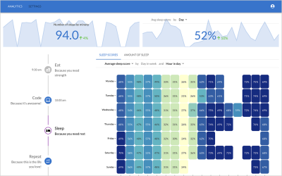
Or how about a sleep tracker hooked up to your phone to track all those important snoozes?
Luzmo Flex: Wearables Dashboard. (Large preview)
When to Consider Luzmo Flex vs Chart Libraries
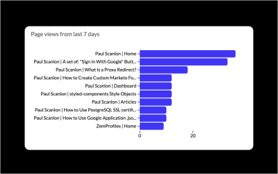
When building data-intensive applications, using something like Recharts, a well-known React charting library, you’ll likely need to reformat the data to fit the required shape. For instance, if I request the top 3 page views from the last seven days for my site, paulie.dev, I would have to use the Google Analytics API using the following query.
To make that data work with Recharts, I’d need to reformat it so it conforms to the following data shape.
[
  {
    "name": "Paul Scanlon | Home",
    "value": 61
  },
  {
    "name": "Paul Scanlon | A set of: \"Sign In With Google\" Buttons Made With Tailwind",
    "value": 41
  },
  {
    "name": "Paul Scanlon | What Is a Proxy Redirect?",
    "value": 23
  }
]
To accomplish this, I’d need to use an Array.prototype.map() to iterate over each item, destructure the relevant data and return a key-value pair for the name and value for each.
And naturally, if you’re reformatting data this way in your application, you’d also want to write unit tests to ensure the data is always formatted correctly to avoid breaking your application… and all of this before you even get on to creating your charts!
With Luzmo Flex, all of this goes away, leaving you more time to focus on which data to display and how best to display it.
The First Steps to Building Bespoke Data Products
Typically, when building user interfaces that display data insights, your first job will be to figure out how to query the data source. This can take many forms, from RESTful API requests to direct database queries or sometimes reading from static files. Your next job will be figuring out when and how often these requests need to occur.
For data that rarely changes: Perhaps a query in the build step will work.
For data that changes regularly: A server-side request on page load.
For ever-changing data: A client-side request that polls an API on an interval.
Each will likely inform your application’s architecture, and there’s no single solution to this. Your last job, as mentioned, will be wrangling the responses, reformatting the data, and displaying it in the UI.
Below, I’ll show you how to do this using Luzmo Flex by using a simple example product.
What We’re Building: Custom Data Visualizations As Code
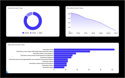
Here’s a screenshot of a simple data product I’ve built that displays three different charts for different reporting dimensions exposed by the Google Analytics API for page views for my site, paulie.dev, from the last seven days.
You can find all the code used in this article on the following link:
(Large preview)
Getting Started With Luzmo
Before we get going, hop over to Luzmo and sign up for a free trial. You might also like to have a read of one of the getting started guides listed below. In this article, I’ll be using the Next.js starter.
Creating a Google Analytics Dataset
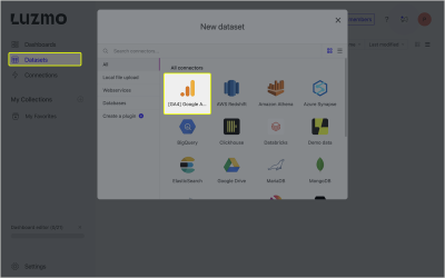
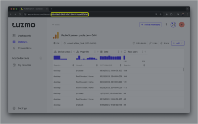
To create data visualization, you’ll first need data! To achieve this using Luzmo, head over to the dashboard, select Datasets from the navigation, and select GA4 Google Analytics. Follow the steps shown in the UI to connect Luzmo with your Google Analytics account.
(Large preview)
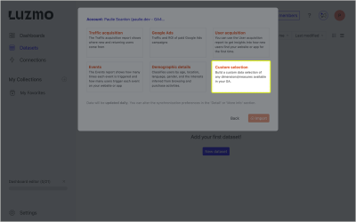
With the setup complete, you can now select which reporting dimensions to add to your dataset. To follow along with this article, select Custom selection.
(Large preview)
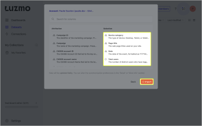
Lastly, select the following using the search input. Device Category, Page Title, Date, and Total users, then click Import when you’re ready.
(Large preview)
You now have all the data required to build the Google Analytics dashboard. You can access the dataset ID from the URL address bar in your browser. You’ll need this in a later step.
(Large preview)
If you’ve followed along from either of the first two getting started guides, you’ll have your API Key, API Token, App server, and API host environment variables set up and saved in a .env file.
Install Dependencies
If you’ve cloned one of the starter repositories, run the following to install the required dependencies.
npm install
Next, install the Luzmo React Embed dependency which exports the LuzmoVizItemComponent.
npm install @luzmo/react-embed@latest
Now, find page.tsx located in the src/app directory, and add your dataset id as shown below.
Add the access object from the destructured response and pass access.datasets[0].id onto the LuzmoClientComponent component using a prop named datasetId.
There’s quite a lot going on in the above code snippet, and I will explain it all in due course, but first, I’ll need to cover a particularly tricky part of the configuration.
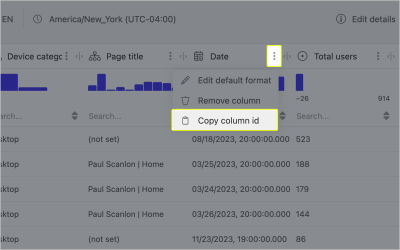
Column IDs
You’ll notice the filters parameters, measure, and categorycontent all require a column id.
In the filters parameters, the key is named column_id, and in the measure and category, the key is named column. Both of these are actually the column IDs from the dataset. And here’s how you can find them.
Back in the Luzmo dashboard, click into your dataset and look for the “more dots” next to each column heading. From the menu, select Copy column id. Add each column ID to the keys in the configuration objects.
In my example, I’m using the Total users for the measure, the Device category for the category, and the Date for the filter.
(Large preview)
If you’ve added the column IDs correctly, you should be able to see a rendered chart on your screen!
… and as promised, here’s a breakdown of the configuration.
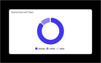
Initial Props Donut chart
The first part is fairly straightforward. appServer and authKey are the environment variables you saved to your .env file, and authKey and authToken are destructured from the authorization request and passed into this component via props.
The type prop determines which type of chart to render. In my example, I’m using donut-chart, but you could choose from one of the many options available, area-chart, bar-chart, bubble-chart, box-plot, and many more. You can see all the available options in the Luzmo documentation under Chart docs.
The one thing I should point out is my use of Tailwind classes: w-1/2 (width: 50%) and h-80 (height: 20rem). The LuzmoVizItemComponent ships with height 100%, so you’ll need to wrap the component with an element that has an actual height, or you won’t be able to see the chart on the page as it could be 100% of the height of an element with no height.
Donut Chart Options
The options object is where you can customize the appearance of your chart. It accepts many configuration options, among which:
A title for the chart that accepts a locale with corresponding text to display.
A display title value to determine if the title is shown or not.
A mode to determine if the chart is to be of type donut or pie chart.
A legend option to determine where the legend can be positioned.
All the available configuration options can be seen in the Donut chart documentation.
The filters object is where you can apply conditions that will determine which data will be shown. In my example, I only want to show data from the last seven days. To accomplish this, I first create the date variable:
const date = new Date(new Date().getTime() - 7 * 24 * 60 * 60 * 1000).toISOString();
This would produce an ISO date string, e.g., 2024-08-21T14:25:40.088Z, which I can use with the filter. The filter uses Luzmo’s Filter Expressions, to determine if the date for each row of the data is greater than or equal to the date variable. You can read more about Filter Expressions in Luzmo’s Academy article.
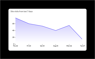
The second chart you’ll be creating is a Line chart that displays the number of page views on each date from the last seven days from folks who visit your site.
(Large preview)
Initial Props Line Chart
As with the Donut chart, the initial props are pretty much the same, but the type has been changed to line-chart.
The options for the Line chart are as follows, and the mode has been changed to line-chart.
options={{
  title: {
    en: `Site visits from last 7 days`,
  },
  display: {
    title: true,
  },
  mode: 'grouped',
}}
Line Chart Slots
The slots object is almost the same as before with the Donut chart, but for the Line chart, I’m using the date column from the dataset instead of the device category, and instead of category, I’m using the x-axis slot type. To ensure I’m formatting the data correctly (by day), I’ve used level 5. You can read more about levels in the docs.
The options for the Bar chart are a little more involved. I’ve included some styling options for the border-radii of the bars, limited the number of results to 10, and sorted the data by the highest page view count first using the sortbymeasure and direction options.
I’ve used the same filters as I used in the Donut and Line chart.
What’s Next
As you can see, there are plenty of types of charts and customization options. Because this is just an “ordinary” React component, you can very easily make it configurable by an end user by allowing options to be set and unset using HTML input elements, checkbox, select, date, and so on.
But for me, the real power behind this is not having to mutate data!
This is particularly pertinent when displaying multiple charts with different reporting dimensions. Typically, this would require each to have their own utility function or reformatting method. That said, setting column IDs and dataset IDs is a little fiddly, but once you have the component hooked up to the dataset, you can configure and reconfigure as much as you like, all without having to rewrite data formatting functions.
If you’re interested in bringing data to life in your application and want to get it done without the usual headaches, book a free demo with the Luzmo team to learn more!
In this episode, Tina dives into her personal journey with hormonal imbalance, sharing the roadblocks and frustrations she encountered with the conventional medical system. She shares how discovering functional testing and a focus on nutrition and lifestyle changes provided new and better solutions for her struggles. Her journey inspired the creation of Metabolism Accelerator, Carrots ‘N’ Cake’s signature functional testing and coaching program. Tune in to learn how a personalized approach to nutrition and functional testing can make a significant difference in your health journey.
Tina talks about:
Her personal journey with hormonal imbalance
Roadblocks and frustration with the conventional medical system
Finding functional testing and nutrition
Inspiration for creating Metabolism Accelerator
What’s included in Metabolism Accelerator
How Metabolism Accelerator works
Ideal client for Metabolism Accelerator
The results you can expect from Metabolism Accelerator
Applications for Fall are open now! Apply for Metabolism Accelerator: https://programs.carrotsncake.com/coaching
Connect with Tina Haupert: https://carrotsncake.com/ Facebook: Carrots ‘N’ Cake Instagram: carrotsncake YouTube: Tina Haupert Pinterest: Carrots ‘N’ Cake Hormone Testing & Nutrition Coaching
About Tina Haupert:
Tina Haupert is the owner of Carrots ‘N’ Cake as well as a Certified Nutrition Coach and Functional Diagnostic Nutrition Practitioner (FDN-P).
Tina and her team use functional testing and a personalized approach to nutrition to help women find balance within their diets while achieving their body composition goals.